
Case study 06 / Wild food mapping / Product & design system
wildnetwork
A map of edible species, soil and seasonality. Built to read like a paper guide.
wildnetwork.app →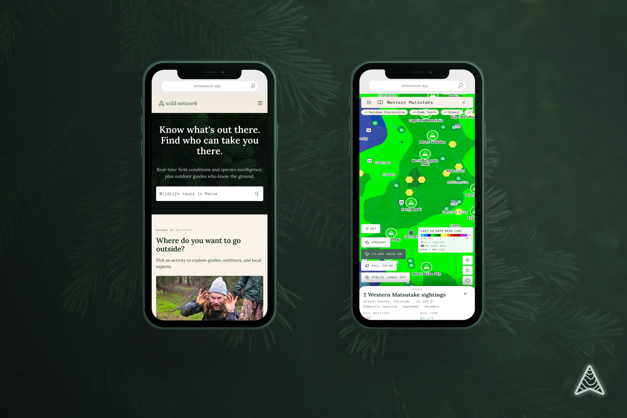
The brief
Foraging knowledge lives in paper guides, forum threads and one uncle's memory. Put it on a map without making it feel like a tech product.
01
Analog on purpose. Parchment and forest green, so it reads as a field guide.
02
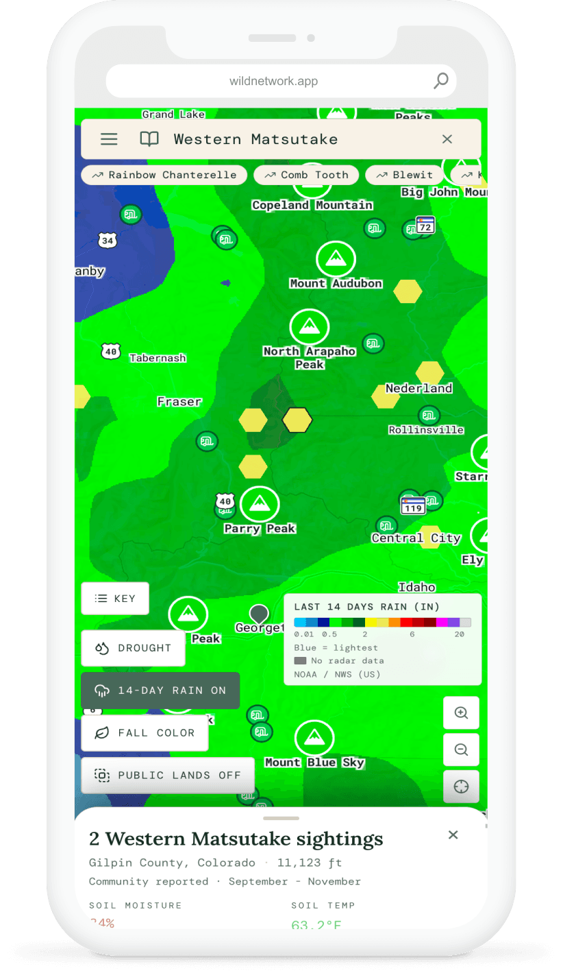
Dense data without dread: seasonality, soil moisture, habitat and forecast on one screen, legible at arm's length in daylight.
03
Two apps, one system. A web map and a phone app that had to look like the same product, not siblings.
Anatomy ofthe Wild mark
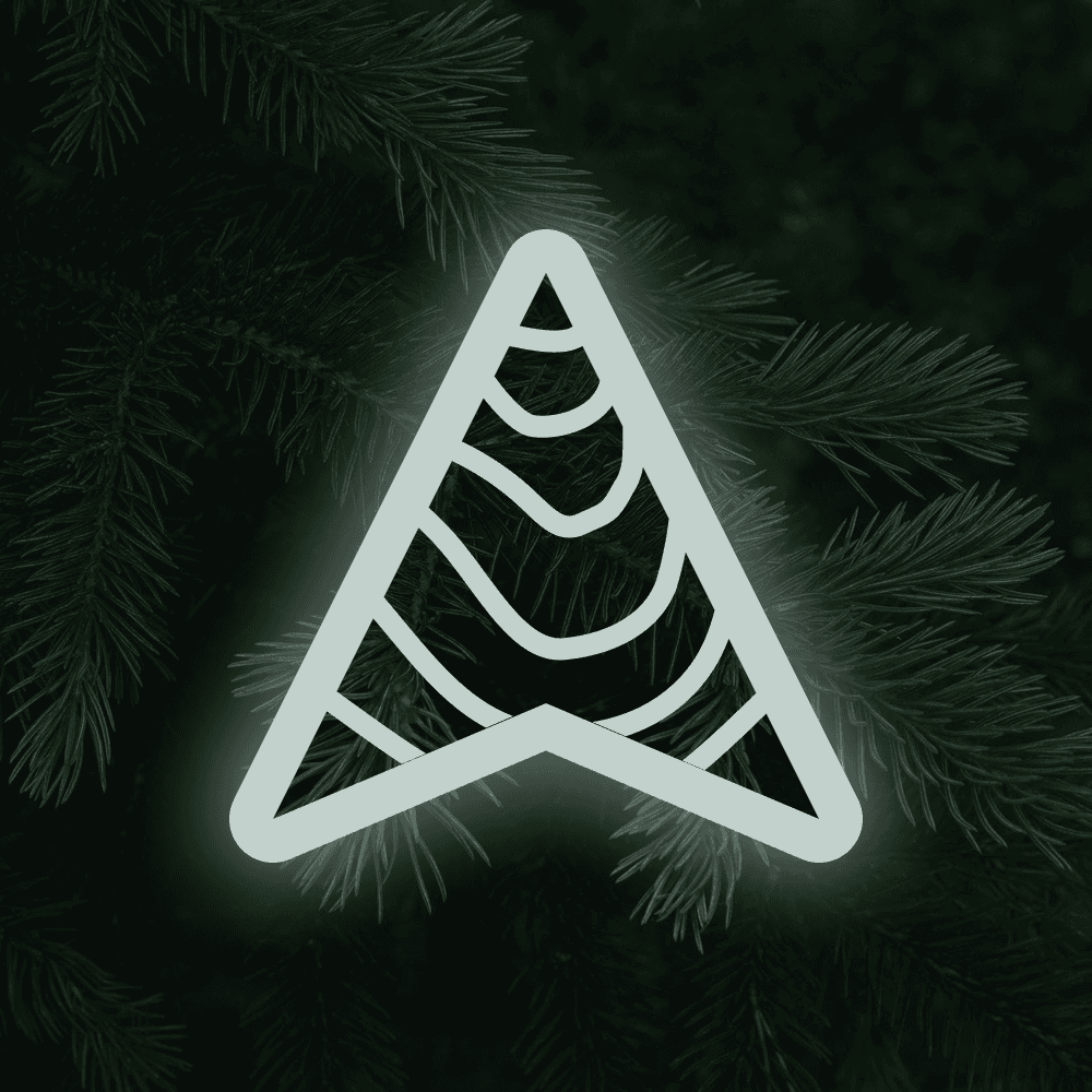
An arrow with a mountain and contour lines inside it. One stroke, no fills.
- APEX
- 48.44°
- STROKE
- 4.4%
- NOTCH
- 19.1%
- ASPECT
- 0.90
- JOINS
- ROUND
- FILLS
- 0
01–07 KEYED TO THE NOTES BELOW
The silhouette is an arrow. The lines inside it read as a peak. Same shape, two reads.
Fig. 02 · Palette
#0F1F18
Forest. The ground. Dark enough to sit under a map.
#4D675A
Lichen. The mark on light grounds, and the chip's ring. Not the mark on dark.
#C2D1CB
Mist. The mark on dark, body copy, and the glow's tint.
Fig. 03 · The glow, and where it belongs
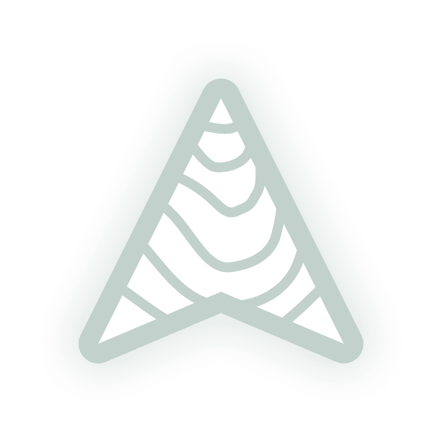
✓ ON FOREST
The bloom has somewhere to fall off to. This is the mark in its habitat.
✗ ON LIGHT
Mist-on-mist. The bloom eats the stroke and the mark stops being a mark.
The recommendation
Treat the glow as a dark-ground treatment, not part of the logo. Ship the master files flat. A blur can’t be embroidered or printed as one ink. Apply the bloom in places you control: splash, dark UI, map.
Fig. 04 · The spec sheet
Off its home ground
Everything below is the flat mark on light. How it ships to partners, printers and app stores. No glow, lichen instead of mist, and a defined way to lose detail as it gets smaller.
Fig. 05 · Lockup spacing

Measured from the drawn artwork: the base corner plus its half-stroke, at x 406. The gap is 0.60× the icon box(269 units). Note for production: the exported wordmark’s clip box ends at x 500, so it carries 94 units of dead space to the arrow’s right. Center the lockup on the ink, not the frame.
Fig. 06 · Type
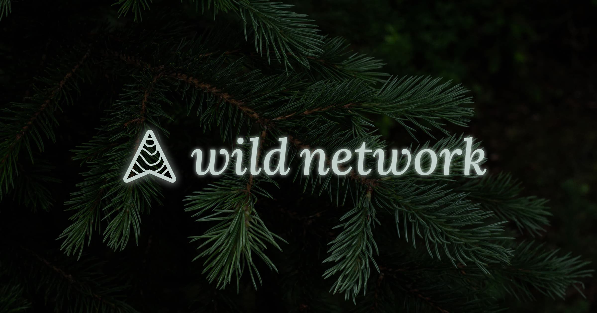
wild network
LORA · MEDIUM 500 · ITALIC
LOWERCASE ONLY · NO TRACKING
Lora Medium Italic, lowercase, untracked. Set the name in the italic only.
Fig. 07 · Clear space
X = the notch rise, 11.4% of the icon box, 27px against this 240px mark. Using the mark’s own interior measure means the clear space scales with the drawing instead of with a round number somebody picked.
Fig. 08 · Size & stroke
Stroke is 4.4% of the box, so it scales with the mark until it would fall under a pixel, where it pins to 1. *Below 48px the contour band comes off: three 0.6px lines inside a 1.4px outline is a smudge, not detail.
Fig. 09 · Lockups
PRIMARY / HORIZONTAL
MARK / STANDALONE
CHIP / ICON · AVATAR · PIN
Fig. 10 · In the map
Location
The mark sits on the coordinate instead of pointing down at it.
Hosts
The chip is the fallback avatar for guides and hosts who haven’t uploaded a photo. Stacked, they read as a group without any extra UI.
Ground
Contour lines as the empty and loading state. Same drawing language as the mark.
The arrow holds at a distance. The contours show up when you get close.
In thefield
The pattern, the mark on pine, the lockup at dusk, and the map in hand. Brand and product as one surface.
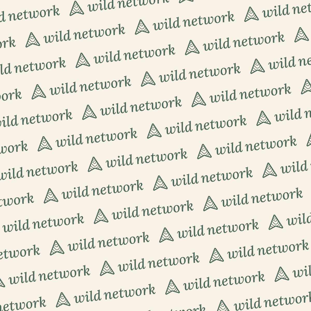
Four parts,two apps
A species row, a condition badge, a card and a layer switch. Bound to shared roles, so the Forest theme is a setting and not a second build.
Common morel
Morchella esculenta
The 8px green dot is the one recurring brand signal. It means in season, and it appears identically in web, mobile and the map popup.
Five states, each with its own fill, border and text color rather than one hue at five opacities.
Outdoors
Satellite
Thumbnails, not icons. Overlays are plain toggles underneath.
8px radius, 16×24 padding, a 1px lift on hover. Workspace surfaces drop to 4px.
Underthe hood
One design system across web and phone, with Stripe for the money that moves through them.
Web
A calm map workspace with room for the guide beside the terrain, and themes that switch without a second build.
Mobile
A phone app on the same design system and shared data, so what you see in the field matches what you saw on the desk.
Map & data
Outdoor and satellite map layers, a species library the team can update, and forecast models that ship with the product.
Pay
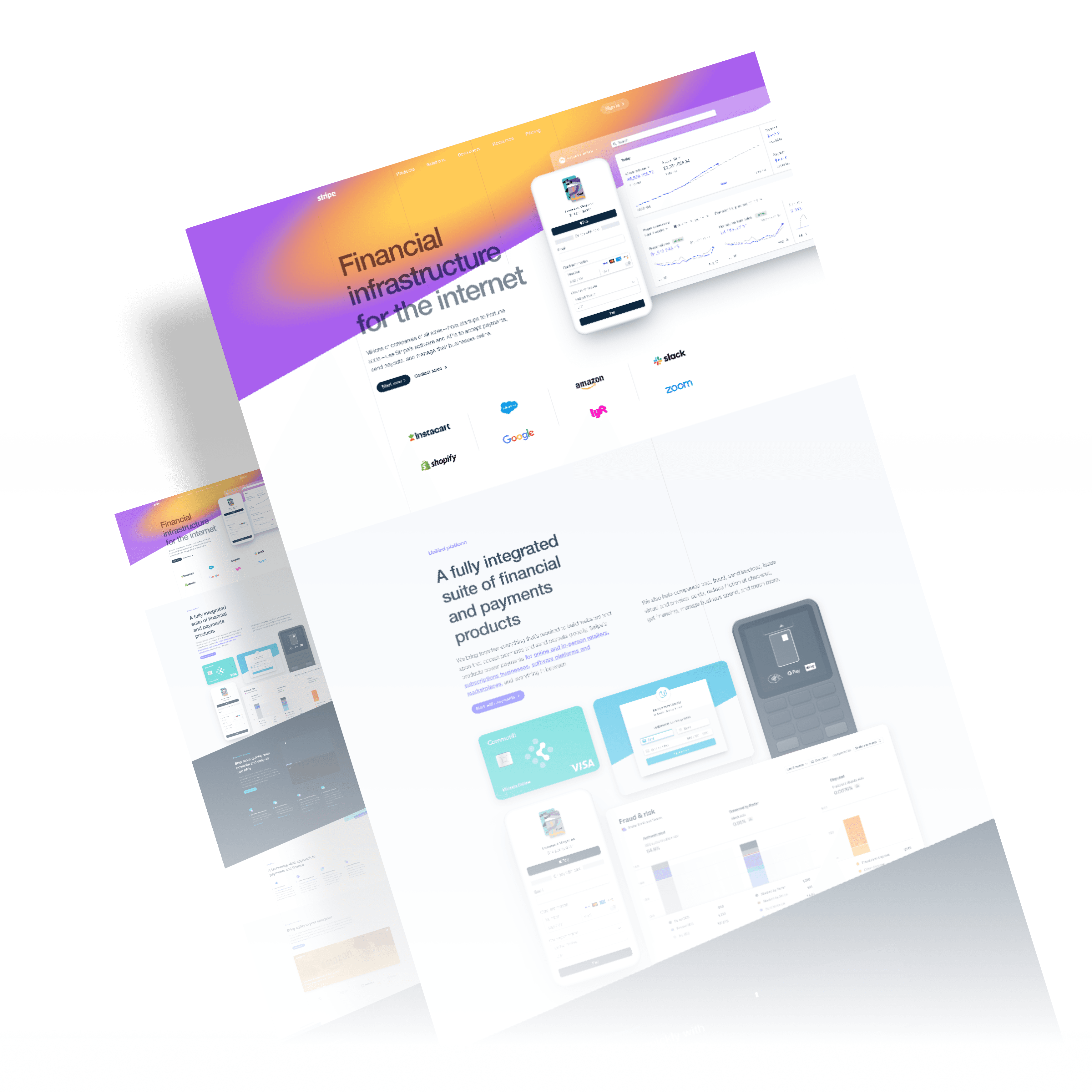
Stripe for memberships, tickets, and host payouts. Checkout stays inside the product.
350+
Users in initial dev
12
Host categories
2
Themes, one token set
Make the data dense and the surface calm.